Showing posts with label Illamasqua. Show all posts

Tuesday, April 12, 2011

Illamasqua Toxic Nature Collection Spring 2011 Swatches and Review


I think Illamasqua and other nail polish companies have very different ideas about creative inspiration. You know what I'm talking about, right? The other brands talk about their inspiration, "Oh, I went to the beach." or... "I took a road trip." or even worse, "I saw a celebrity." But Illamasqua doesn't just get inspired, they make their inspiration. They take an idea and build an entire world around it. They even give it a backstory! And that's what always makes me so excited to see what they're going to do next.

Toxic Nature is no exception. In fact, I think it's their most creative collection yet. I'm so behind in posting these, so I know you've all seen the amazing makeup artistry and fantasy world images surrounding this collection. When I first saw them, my eyes went like this: O_O

The nail lacquer portion of this collection consists of these five shades:

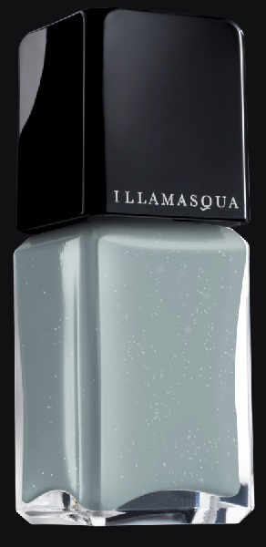
Bacterium. Doesn't this color make you a little uncomfortable? The name, the murky, stagnant, dirty look of it? This is a mousy taupe/light brown/warm grey base with some frosty duochrome greenish shimmer. It has a little bit of a yellow undertone to it. It's like a decomposing version of Zoya Pasha.

Gamma. Awesome, eye-burning neon orange. Since it's neon, it dries matte. You can wear it matte if you'd like, or add topcoat to make it glossy. Either way it will look loud!


Purity. A clean, sweet and natural shade that contrasts with the bizarre, mutated, toxic and dangerous colors in the collection. This is a soft creamy pale peach. For comparison, it's more warm and pale than MAC Seasonal Peach and not as pink as Essie Van d'Go.


Stagnate. Good name to go with this color. It's a murky purple-grey-brown creme. What was that word they use for this now? It's like "greige" but with purple... Grurple? I forget. As much as I do love these types of colors, I must say, it's so common now, there are so many of them, that it does look a little stagnant to me.


Radium. A bright yet dirty radioactive pea green. What makes this special is the blue-green subtle shimmer that lights up when the light hits it. You can't see as much of the blue shimmer indoors, but it looks great in sunlight.


The formula on these was different. It wasn't the same consistent, creamy, dense one-coat-opaque formula I'm used to from Illamasqua. Each color seemed to have a completely different texture. Stagnate was thin almost a little sheer, Gamma was thick and jelly-like, Radium was almost like normal Illamasqua formula, Purity was sticky feeling and Bacterium was a little runny. Despite the mixed bag of formulas, both wear time and dry time were excellent. Every shade except the neon Gamma dried very shiny even without topcoat. I was able to get nearly a week of wear out of Radium without chipping or tipwear.

I love the theme and artistry of this collection. I love how they intertwine beauty and poison, danger and glamour... Nature fighting back... Seriously, doesn't it make you a little uneasy but excited at the same time?

I do wish the colors were more uncommon, though. They're good colors, but shades like pea green, neon orange and grey/purple/brown have been really common lately, so you really have to put something extra intro them to make them stand out among the crowd. That being said, I am very fond of the unusual combination of colors in this collection, and I can rarely pass up a neon orange. The scary radioactive brightness of Gamma and Radium, the murky dirtiness of Bacterium and Stagnate and the clean and pretty Purity to return you to normal when it all becomes too much...

(These were sent to me for review.)

Thursday, March 17, 2011

I don't want to go on the cart...


Well, uh, hey there guys! I know I haven't posted in quite a while so it's a little awkward starting this post. I ended up being sicker than I expected and I'm still not fully recovered. Unfortunately, I was still in the middle of swatching when I got sick so I don't have any of the new collections finished enough to post yet.

Just wanted to let you know that I'm still alive and that when I'm completely recovered I'll be getting back to posting. I leave you with the last mani I did before I got sick:

Illamasqua Radium as a base with Illamasqua Gamma polka dots and China Glaze Lightning Bolt on the ring finger. I haven't swatched the whole Toxic Nature collection (I will soon!) but I wanted to try on some of the crazy colors and this is what I ended up with. It's like crazy nuclear toadstool psychedelic acid trip terror moldy nightmare. I love it. I'll go into more detail about the collection when I finally get my review finished, but let me just say that Illamasqua really knows how to create a whole fantasy world just based on colors.

That mani lasted a really long time, too. An entire week. Of course, I wasn't doing anything besides sleeping and tripping out on NyQuil, but still... it lasted the whole time without chipping.

See you in a bit.

Wednesday, January 19, 2011

Illamasqua Throb Collection for Valentine's Day 2011

Oh, Illamasqua, you've done it again. Another collection that's making bloggers buzz... I have the nail portion of the collection to show you, but first, feast your eyes on this:

Gaaaah that is so awesome. I love everything about this picture. Illamasqua = artistry.


Let's get this one out of the way first. It's a creamy off-white polish that has more than one thing in common with this album cover:


*ahem* So, here it is...


Load. Yep, it's exactly what you think it is. The color is really unique, though- an off white with a strong yellow undertone. It's not a clean white by any stretch of the imagination, but it is definitely easier to wear than your standard stark white 'white-out' style white polish. I'd like to think that it looks like buttercream frosting made with real butter and regular vanilla extract (not the clear wedding cake kind). Yeah... buttercream frosting... That's it. Keep telling yourself that.

Throb. A perfect Valentine's Day red creme. Cherry red. I love these types of pin-up girl red cremes. Great formula on this, too. Complete coverage in one coat, but I think it looks nicer and bolder with two.

Scorn. Scorn is part of this collection, too, but you may already have it from when the Nail Quills came out. To recap: Matte black creme, leather-rubber semi-matte finish. Great formula.

And just for fun, I wanted to try out that heart mani from the promo pictures:


This is using Load as the base color and Wet n Wild Black as the heart portion. It's a little sloppy and not quite perfect. But hey, it's my first try, almost no one can be expected to get it perfect on their first try. I applied the black making swooping motions with the plain' old polish brush. Next time I'll use a striping polish with a long brush, but I didn't have one handy this time.


The formula is varied. Throb and Scorn are completely flawless in every way. Load is pretty streaky and needs three coats to be completely even. Drying time is good and the polishes dry to a nice glossy finish even without topcoat. Well, except Scorn, obviously.

Red creme and black matte aren't exactly groundbreaking new colors, but Load is definitely an uncommon shade. I do kinda like it for the novelty aspect... but even excluding that, it's still a really interesting color. Reminds me of antique lace. I want to do some lacy looking Konad prints over it.

(These were sent to me for review.)

Monday, December 13, 2010

Illamasqua Nail Quills and Scorn Matte Finish Polish

Illamasqua's latest creation. Once again they've done something totally unique- you won't see these anywhere else! They're nail quills. A set of two matte black and chrome accessories for your thumbs, inspired by one of these:

They come in a ridiculous nice box. It's plain matte black with a shiny Illamasqua logo for contrast. It has a really sturdy suede-ish fabric lined sleeve that protects the matte black jewelry box containing the Quills. I know it's just packaging, but man, it's so fancy and expensive feeling!

With the outer portion on...


The inner box. It looks really light and grey here because of the lighting, but look how it picked up on the texture of the box. That's weird and kinda cool, I don't know how I managed that. The box feels like it's a smooth satin fabric but it also looks like cardboard... not sure which it actually is, but it's pretty.


Open the box...

Two nail quills and a little double-sided card that has some info about the nail quills and Mike Pocock (the creator/designer of the Quills) on one side and the opposite side is printed with the signature Illamasqua wood nymph looking lady. One funny thing to note- there's a legal disclaimer on the card that says that Illamasqua isn't responsible for any damage caused while wearing the Quils...


When you pull up the little ribbon, this chamber is revealed. It holds the application instructions, a little tube of nail glue and four stick-on tabs. I love the design of this box. Secret storage for the less-glamorous items!

Some more shots of the quills in their case:


In case you're wondering just how exactly they're secured:

There's a little sticky tab underneath each quill. Probably not the most permanent solution for holding the quills, but you can always store them under the flap if the tabs lose their stickiness. Also note the construction of the quills from the underside. The rough black part feels like acrylic sealing in the edges of the chrome foil material. The bottom part is a smooth plastic like a nail tip or press-on nail (which is what these are). Each set of quills is handmade and unique and have their own little quirks and imperfections.

Now, these are slightly too big for my thumbs so they look a little 'off', but I just had to try them on. You might be able to file down the edges/sidewalls if they're too big, but I was afraid to... Didn't want to accidentally ruin them. I used the sticky tab with no glue.


So wicked looking. They're quite long and rather pointy so do take care when wearing these. They're a little flexible so that you don't do any major damage, but you could still poke yourself if you're not careful!


Application is extremely easy. For this very temporary application, I used only the adhesive tab. If you've never applied an adhesive tab, this is all you do: Prep the nail by wiping it with alcohol or acetone, peel the tab off of the paper sheet but leave the paper backing on. Place the sticky side of the tab onto your nail and smooth it down so that it lays flat with no wrinkles. Peel off the paper backing and press the nail quill onto the sticky part. Voila! Easy. But, keep in mind that adhesive tabs are not very strong and won't really last more than an evening.

The instructions recommend combining the tabs with the glue for a longer wear and to preserve the life of the Quills. It instructs you to apply the tabs like normal, but then apply a few drops of glue on the tabs before you apply the Quills. This is so you can remove the Quills without ruining them by soaking them off like you'd have to do if you use the glue alone.

To remove them when applied with tabs, you run your thumbs under warm water and just peel them off. It doesn't damage your nail at all because it's just sticky tape. For removal with glue plus tabs, you can do the same thing but you may need to clean the underside of the quill because there will be a little sticky residue left from the tabs.

Easy to apply, easy to remove. Looks awesome and will definitely make you stand out. The only downside I can think of is the price- they're £35, which is about $55 USD. They are quite limited and all handmade, a true collector's item, so they'd have to be a little on the pricey side, but I do think that £35 is quite steep. The info about them says that they're bespoke- which, as I understand it, implies custom made to your specifications, but I'm not entirely sure if/how that works with these. If they are all custom fit, that would definitely justify the price.

So, now you have pointy matte black and chrome thumbs, what do you do with the rest of your nails?

That's simple- Scorn nail polish. It's designed to compliment the quills- it has the same color and finish.

This is two coats of Scorn. It has amazing coverage and smooth, even formula. The finish isn't really a true matte- it has some shine to it. You know I'm all about the super chalky matte-mattes, so this isn't exactly my favorite finish, but it does match the Quills. It looks like leather to me, so that's cool. If you wanted to continue the matte black and chrome theme, you could put a little silver gem or stripe of foil nail art tape on each nail, too.


I think these are really crazy and I love them! They're a weird combination of beautiful/glamorous and intimidating/tough. They're delicate but at the same time they're knife-like dangerous! I was expecting a true stiletto shape, but they actually are quill-shaped, which also impresses me. If you want this look but can't afford the price tag, you could always go to a salon to get your thumbs done in black and silver acrylic stilettos, but they won't be quite the same and they won't be re-usable.

This would be a good gift for a nail fanatic who loves to be different and stand out. The box and packaging and presentation makes them very gift-able. Available only on Illamasqua.com and at the flagship store on Beak Street in London.

(These were sent to me for review.)

Thursday, November 18, 2010

Illamasqua Nail Quills?! Now these are cool.


I've never seen anything like this. I just got this press release, check it out:


Luxury, Handmade Bespoke Nail Quills

Cult British beauty brand Illamasqua pushes their avant-garde, cutting-edge credentials even further with the launch of the Limited Edition Nail Quills...


Unique, extraordinary and extravagant, these tantalising talons are like nothing you've ever seen before.

Two Nail Quills per set, designed to be worn on either thumb, are a perfect matt black with a silver tip. Presented in a beautiful gift box they come complete with nail tabs and glue, these are set to become real collectors items. To complete the look, the Nail Quills work best with matt black Nail Varnish in ‘Scorn.

Designed and hand-crafted exclusively for Illamasqua by one of the hottest names in nails Mike Pocock, who has worked with prestigious fashion titles such as Italian Vogue, British Vogue, W, Harpers Bazaar and Dazed and Confused. He has also complemented the aesthetics of visionaries such as Nick Knight, Steven Miesel and Katy England.

“I was inspired by the contrast between Illamasqua’s new black Nail Varnish in ‘Scorn’ and the bright metallic of the nail wrap I have developed.” Mike Pocock

False nails will never be the same again!

A set of ‘Nail Quills’: £35

Nail Varnish in ‘Scorn’: £13

The Limited Edition Nail Quills are exclusive to illamasqua.com and the Flagship Store at 20 Beak Street, London from the end of November 2010

Friday, October 15, 2010

Illamasqua Nail Varnish Competition - Win bottles of Illamasqua's contest shades!

Don't forget- tomorrow is the last day to enter! I want everyone who wants a chance to win to be able to enter before it ends!


(I'm going to bump this to the top of the page so it doesn't get buried- still a long time to enter)

Illamasqua wants to give you a chance to win all three of their Contest winning shades! You know the ones- Eclipse, Shrapnel, Raindrops- the final three user-submitted creations chosen from over 6,000 entries? You can see swatches of them here and here if you're not familiar with them.

Illamasqua is holding a competition (more of a give-away, really!) in October where you can enter to win all three Contest Winner polishes. All you need to do to 'compete' is answer an Illamasqua trivia question!

Visit http://www.illamasqua.com/scrangie/ from now until October 16th 2010 (11:59pm GMT) and enter your name and email address and answer the trivia question to be entered into the giveaway. Illamasqua will choose a winner at random on October 20th 2010.

The winner receives a bottle each of Eclipse, Raindrops and Shrapnel PLUS bottles of Illamasqua's basecoat and topcoat for the full Illamasqua experience (worth $66.00 USD!)

Edit: This contest is open worldwide! International readers may enter!
Edit number two!: Only one entry per person, please!

Whoever wins the competition, I want to see your swatches! If you're the winner and a blogger, send me a link if you post them!


(Disclosure: I don't work for Illamasqua and am not getting anything in return for this- it's just for fun! )

Wednesday, September 22, 2010

Illamasqua Art of Darkness nail polish for Winter 2010

Two more dark shades from Illamasqua. Thankfully, I like these much better this time, no disappointment here!


Scarab. My favorite of the two. A rich, velvety red shimmer. This is not just plain red- it's a little brown toned and has some gold in it. It's one of those dark on the edges/light in the middle glowing 'lit from within' shades that I love so much, like OPI Royal Rajah Ruby. It has some really awesome looking gold duochrome in the bottle but it's not really visible on the nail. Oh, and it's a one-coater. I did two here just because. I like everything better with more coats anyway.


Viridian. A deep blue-green shimmer. People were telling me this was frosty... I don't see frosty here... I see shimmer. I am relieved. Not brushstroke-y, not dusty looking, just a nice green shimmer. Gorgeous gem-like shade, but I feel like I've seen it before... It strikes me as being similar to Nubar Earth or something in that blue-green shimmer category. Makes me think of Christmas ornaments, both these colors together. Cute!

The formula on these was excellent in true Illamasqua tradition. Super opaque, I did two coats in these pictures but I really only needed one. Smooth, even, not runny or too thick, just all around good. Drying time is average, nothing worth noting. Dries to a dull finish, but that's sort of irrelevant cause topcoat instantly removes that... just thought I'd mention it, though.

I like these. Scarab came in a cool box with an over-sleeve with a picture of a Scarab beetle on it and some spooky butterflies on the side. It was a nice touch, unfortunately I forgot to photograph it once I saw the polish inside! I usually love polishes with names that remind me of things, but these polish names make me totally geek out.


* is dork *

(These were sent to me for review.)

Friday, September 3, 2010

Closer look at the Illamasqua Contest Winners

So, I've now seen them in sunlight and worn them each for a little while and here's what I think.

Eclipse. Let's just get the one out of the way first. This color is nothing like I expected it to be based on the early images. In reality, Eclipse is a dark blue with silver frost. It is slightly purple- it is more obvious in real life, but there are definite purple tones in this. The color is nice but I'm just not really on board with this new Frost Revival thing going on. It's really not a bad polish at all, but my expectations were just super high for this... This was what I hoped it would look like:

Dark purple, blue, green- duochrome looking with glitter or even flakes. Isn't that what it looks like there? It looks incredible. I was so excited about this shade. But now all I can say is this:


Raindrops. Actually... my blurry low-light picture of this was better at showing the cool qualities of this shade. It's a blue-toned light grey jelly-creme (very sheer- this is three thick coats) with lots of random and irregular shaped silver flakes. This one turned out really well, pretty much exactly like the promo shot:


Shrapnel. This isn't as bad as everyone's making it out to be. I rather like it. It's a coppery rose gold metallic- or is it chrome? Yes, it's frosty but it is super shiny and reflective, so it has more of a chrome finish than a true frost. Reminds me of the China Glaze Romantique collection chromes. Very, very shiny. I had expected this to be more of an orangey copper flame type shade with glitter, but it's really quite different! This has a definite 80's dance party look to it. Retro-futuristic. And yes, brushstrokes :( But, I think this might be great for Konad- it is VERY dense and pigmented- this is one coat. But really, nothing like I expected based on this:

Yeah... that's really not the same polish, is it?

But, the formula was great as usual. It's Illamasqua. Their formula is one of the best I've ever used. Thick, opaque, smooth- with the exception of Raindrops which is sheer. Drying time was good. Brushes were nice and even and thick. No problems with the formula or brushes.

You know, this is really sticky territory for me. On one hand, these polishes definitely weren't what I was expecting, but on the other hand I don't want to insult or upset the winners of the contest because I was disappointed. Also, I am a giant Illamasqua fan and this is the first time I have been let down by the colors, that kinda stings... I think Raindrops turned out the best and truest to the original pictures, but I really loved the inspiration behind Eclipse and Shrapnel too. If any of the winners are reading this- how do you feel about the end result? Is it what you imagined it would look like?

And also because I'm really super curious about what the other entries were like- how many of you entered? What was your color going to be like? I'm positively dying to know this. Please comment and tell me all about it if you entered.

I have seen a disturbing amount of frosts this year... I hope this is just a phase.

(These were sent to me for review.)

Thursday, September 2, 2010

Preview of the Illamasqua contest winning shades

Please refer to my previous post about these for details, cause I can't remember what they were! XD

These just arrived and I couldn't wait to get them on my nails, so I snapped a few dimly-lit and not so fantastic pictures and figured I'd share :) I will attempt to get 'real' pictures when the sun comes back, but for now I'm really enjoying this rain, even if it means crappy swatches!

(And I apologize in advance for all the smudges and fingerprints on the bottles... this acetone + glycerin swatching remover makes my hands kinda sticky... ew.)


Eclipse. A frosty dark blue with hints of purple. I had really high hopes for this one based on the promo images- it looked like a dark blue/purple duochrome with silver microglitter, but alas, it is not.


Raindrops. This is prettier than I expected! It is sheer- this is three coats- but the sheerness really helps the little silver flakes shine through. And it reminds me of this:


Shrapnel. This one doesn't quite look like I imagined it to look based on early images, but it's really interesting! It's a bright copper or perhaps rose gold metallic, a little frosty but more shiny/chrome/metallic than true frost and it has really tiny silver microglitter. Super opaque, this is one coat. Great coverage. Very flashy.

I want to evaluate these in sunlight to get a better understanding of the colors.... Will come back to these.

(These were sent to me for review.)
 

blogger templates | by toblack