Showing posts with label red. Show all posts

Friday, March 25, 2011

Zoya Summertime Collection Summer 2011 Swatches and Review

Here's part two of the big Zoya summer collection. It's called Summertime and it's six creme shades.


Areej. This one's a deep pink / fuchsia creme. Very smooth and creamy looking, slight muted quality to it.


Breezi. A teal-blue shade. More blue than teal, but has a definite teal tone to it on the nails. My picture makes it seem brighter than it is; in real life it has a soft dustiness/murkiness to it that just doesn't come across in my picture.


Kieko. A red-purple creme. Much more red toned in real life, more of a berry than a true purple. Think Jessica Feather Boa from the Burlesque collection to give you an idea of the shade, it's similar to that but with a little more blue to it.


Mira. A medium purple creme. Again, my picture makes this purple pull too blue toned, it's much more red toned in real life. It's actually really similar to those China Glaze Grape Pop / Rescue Beauty Lounge Mismas type purple cremes that came out in the past few years. It's just a touch lighter and warmer toned, but still very similar.


Sooki. Bright cherry red creme. This is my favorite of the collection. It is loud and obnoxious and AWESOME. It's one of those flashy bright reds that you can see from a mile away. It seems to have a less dense creme finish, like it's almost a jelly, but not quite squishy enough looking. Very hot.


Tamsen. My second favorite in the collection! Can you believe it? A collection with two purples and a blue and my favorite colors are the red cremes... But I'm totally serious. This is a great red. I took two pictures to try to convey the warm orange tone that's in this compared to the coolness of Sooki. This is like a brick red, or even a red-orange. It's muted and a bit dusty looking like some of the other shades in this set. This one changes in different lighting, too... In artificial light it looks more pure red to me, but in sunlight it looks almost entirely orange. Really like the warmth and softness of this particular red.

The formula on these was great. Smooth and consistent, not too thick or thin and no difference in formula across the whole set. Opacity was great, too. They only needed two coats, but I did three just to see how it looked. These do not suffer from the extremely long dry time that the Sunshine shades have, these have a normal/average dry time.

Overall, I can't say I think this is a super exciting collection. I do like the shades, but I feel like I've seen them all too many times before- medium pink creme, purple-berry, dusty teal, medium warm purple, red creme... Nothing really unique or new. Sooki and Tamsen really stand out to me. The vivid brightness of Sooki and the warm rustiness of Tamsen make them very visually appealing compared to the muted pinks and purples in this set. Breezi is a really nice interesting shade, too, but it doesn't excite me the way Tamsen and Sooki do.

Nice formula, though!

(These were sent to me for review.)

Tuesday, March 22, 2011

Zoya Sunshine Collection Summer 2011 Swatches and Review

My first summer collection post of the year! A welcome change from all the bland colors I've been staring at lately. The Zoya Sunshine set is the shimmer half of their summer collection. It reminds me a little of their Sparkle collection from last year, tons of glittery sparkle in these. Take a look.


Apple. See what I mean? Look at all that gold sparkle. This shade is a light yellow-toned green with crazy amounts of sparkling gold flecks. It looks like it could be a nice match for Color Club Magic Elf... I haven't compared them on the nail yet, but they strike me as being extremely similar.


Faye. This might be my favorite of the collection. I don't think I have another color quite like this. It's a warm prune purple base with insane gold sparkle. It's so bright. And it's not exactly glittery; the particles are really smooth and thin and shiny, not chunky or rough like true glitter. They blend together and make a really glowy smooth look.


Kimmy. Such a hard color to capture, it's so rich and colorful and sparkly. My camera can't handle it! The gold metal flakes and the saturated warm red go so well together. It looks like fire.


Reva. This color is much cooler and saturated in real life, the lighting is washing out the color in this picture. It's the cool toned counterpoint to Kimmie. It's a strawberry shade... except imagine that instead of seeds, the strawberry is speckled with 24 karat gold.


Rica. A golden coral glimmery shade. I like the depth in this, it's not a flat shimmer at all. The base of these colors is sheer and the gold flecks look really cool through the sheer base.


Tanzy. A light orange with gold fire. It's a little like Gabrielle, but the flakes are smaller and shinier.

The formula on these was different this time around. The biggest difference is the drying time, which is much longer than I'm used to from Zoya. The texture is a little thicker on these compared to the similar Sparkles, and they're more sheer so those factors could contribute to the long dry time. The Summertime half of the collection doesn't have the same long dry time. These were on the sheer side and I found that they looked best with three coats. I'm wearing three coats in all these pictures. Application was good aside from the thicker than usual texture.

All of these colors are so glowy. They're luminous. I really like how they look like they're glowing when you're wearing them. The colors are bright and cheery, and the cheeriness is only amplified by all that golden glow.

My top picks are Faye, Kimmy and Reva. All of them are nice, but those three wow me the most. Faye, because it's unique and gorgeous and Kimmy and Reva because they're so rich and colorful and the red shades look amazing with the gold metal flake.

And, I'm sure you've all seen the news about the promo, but just in case, I'll post it for you:


Do you have an account** on Zoya.com? If you answered yes, a very special offer is waiting for you!

A BOGO (Buy One, Get One) Offer*
on the new Zoya summer collections
12:01 EST 3/21/2011 - 11:59 EST 3/25/2011 only.

As an ADDED BONUS for taking part in the exclusive account holders only BOGO Offer*, standard shipping will be only $2! (Order more than $55 and shipping will be free!)

You can BOGO* any colors from Zoya's ModMattes, Summertime and Sunshine collections! With 15 new colors to choose from you are bound to find plenty of BOGO offer* options to love!

Please see the ZOYA blog (http://zoyanailpolish.blogspot.com) for complete details.

*Offer open only to those with active accounts** on Zoya.com, artofbeauty.com, Qtica.com and qticasmartspa.com as of 3/20/2011 at 5 PM ST. Offer open to consumers, Online promotion only. Continental US ONLY. BOGO Offer* is good on Open stock .5oz Polish ONLY from Summer 2011 collections. (Zoya Summertime, Sunshine and ModMatte) BOGO Offer good for up to 7 polishes. BOGO Offer* code is unique and non-transferable. One code per account. Code expires on 3/25/2011 at 11:59PM EST. Standard ground shipping is $2.00 and FREE for orders over $55. Upgraded shipping not available for this promotion. Please allow standard time for processing and shipping, however if volume is higher than expected please allow up to 4 weeks for shipping and processing. Please allow 2-6 weeks for delivery. Comments, videos and pictures posted about this Zoya.com BOGO Offer* outside of Zoya.com or zoyanailpolish.blogger.com are not representative of the opinions of Zoya Nail Polish, Art of Beauty, Inc., Qtica and Qtica Smart Spa and we do not confirm the accuracy of any postings..

**Qualifying accounts are those with a valid username (email) and password that has been created and used in the last 3 years account must be made by 3/20/2011 at 5PM EST to qualify for the BOGO Offer. No purchase necessary to start an account. Customers are responsible for maintaining active accounts. If username or password have been lost we (Art of Beauty, Inc.) are not responsible for restoring accounts or giving out any account information.


(These were sent to me for review.)

Wednesday, February 9, 2011

First Valentine's Day Mani

This weekend I did my first Valentine's Day-inspired manicure. It's not quite the typical Valentine's theme, but I had the urge to use these colors together, and this is what happened!

I think I'll try to do a couple more. Maybe I'll re-do that Illamasqua Heart mani that looks like saddle shoes, but this time do a better job. I think for my actual Valentine's Day manicure I'm going to use the Art Club Glam decals with the gold hearts, maybe over light pink or white.

I tried a different technique for applying Black Shatter this time, thanks so much everyone for the tips! You guys rock.


This was: Two coats of Sally Hansen Xtreme Wear Night Lights over one coat of NYC Black (not a very good black polish, sadly) with OPI Black Shatter over two coats of Nicole OMB! on ring fingers and thumb. Night Lights is a nice chunky holo, sadly, this type of lighting is not good for capturing holo.

On this hand I tried a zig-zag diagonal pattern for applying the crackle polish and I think it turned out great!

I forgot to take a picture of the other hand until I'd already been wearing this for a couple days:

On this hand I did the random-blobs-of-crackle technique, but I don't think I did it right, it didn't crackle enough cause I made the blobs too thick. Very different look from the other two methods, though! I got bad shrinkage on my thumb because I did two coats of Seche Vite instead of regular topcoat and then Seche. Lesson learned!

Last night while I was out grocery shopping, I picked up some really cool Kiss decals that I think would make a good gothy Valentine's day design... Now I just have to think of a creative way to use them. I'll try to post a picture of them later.

Wednesday, January 19, 2011

Illamasqua Throb Collection for Valentine's Day 2011

Oh, Illamasqua, you've done it again. Another collection that's making bloggers buzz... I have the nail portion of the collection to show you, but first, feast your eyes on this:

Gaaaah that is so awesome. I love everything about this picture. Illamasqua = artistry.


Let's get this one out of the way first. It's a creamy off-white polish that has more than one thing in common with this album cover:


*ahem* So, here it is...


Load. Yep, it's exactly what you think it is. The color is really unique, though- an off white with a strong yellow undertone. It's not a clean white by any stretch of the imagination, but it is definitely easier to wear than your standard stark white 'white-out' style white polish. I'd like to think that it looks like buttercream frosting made with real butter and regular vanilla extract (not the clear wedding cake kind). Yeah... buttercream frosting... That's it. Keep telling yourself that.

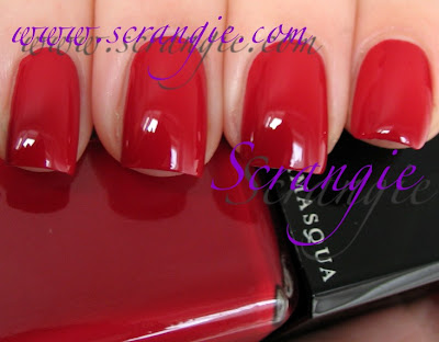
Throb. A perfect Valentine's Day red creme. Cherry red. I love these types of pin-up girl red cremes. Great formula on this, too. Complete coverage in one coat, but I think it looks nicer and bolder with two.

Scorn. Scorn is part of this collection, too, but you may already have it from when the Nail Quills came out. To recap: Matte black creme, leather-rubber semi-matte finish. Great formula.

And just for fun, I wanted to try out that heart mani from the promo pictures:


This is using Load as the base color and Wet n Wild Black as the heart portion. It's a little sloppy and not quite perfect. But hey, it's my first try, almost no one can be expected to get it perfect on their first try. I applied the black making swooping motions with the plain' old polish brush. Next time I'll use a striping polish with a long brush, but I didn't have one handy this time.


The formula is varied. Throb and Scorn are completely flawless in every way. Load is pretty streaky and needs three coats to be completely even. Drying time is good and the polishes dry to a nice glossy finish even without topcoat. Well, except Scorn, obviously.

Red creme and black matte aren't exactly groundbreaking new colors, but Load is definitely an uncommon shade. I do kinda like it for the novelty aspect... but even excluding that, it's still a really interesting color. Reminds me of antique lace. I want to do some lacy looking Konad prints over it.

(These were sent to me for review.)

Tuesday, January 11, 2011

Nicole by OPI Justin Bieber One Less Lonely Girl Collection 2011

It's here. The much talked about nail polish collection inspired by Justin Bieber. I'm still not exactly sure how Justin Bieber and nail polish are related at all, hey, the colors ended up being really cool...


I took full advantage of the twenty seconds of sunlight we had this week...


Give Me The 1st Dance. Standard sparkly silver foil. Not unique, but not a bad color.


My Lifesaver. Wow. This one was not in the promo pictures I originally saw of this collection, so it was a complete surprise. It's awesome. It's not as sky blue as it looks here, it's actually a turquoise creme. The shade is somewhere between MAC Peppermint Patti and China Glaze For Audrey, closer to the Peppermint Patti side. Super creamy finish, easy, non-streaky application, very pigmented. All around great shade.


OMB! Another pleasant surprise. Very different from the promo pics. This is an amazing fiery, duochromey glass fleck red. My pictures don't do it justice. The main duochrome colors are orange and pink, weird contrast between cool and warm in this polish. See this one in real life if you get a chance.


Me + Blue. A blue shimmer base absolutely packed with holographic microglitter. There's just a ton of glitter in this. It's not your traditional holo that's made from little flat sheet-like particles. This is like some of the Nubar Gems that are a shimmer base color with chunky holo glitter, but so much of it that it looks like a true holo under sunlight. It is a little lumpy, but because there's so much glitter you almost don't notice.

Just for fun I put OPI's Black Shatter on top:


One Less Lonely Glitter. What a name. Great color, though! Light lavender glitter in a clear base. It has tiny little glitter particles mixed with bigger round pieces. Very sparkly. Delicate. Nice opacity, too.


Prized Possession Purple. A medium purple shimmer. Very pretty color, but the formula was quite unruly. It was very watery and the brush was defective so I found it rather frustrating to apply. I wish I had something better to say about the formula because the color is so nice, but it reminded me of trying to apply NYX Wild.


Step To The Beat Of My ♥. One of Nicole's signature heart polishes. This one is tiny opal glitter in a very faintly purple tinted base and it has purple and red holo metallic hearts. This is meant for layering but if you like a more subtle look you can wear it alone.

The formula on these was good with the exception of Prized Possession Purple. I did two coats of all but Prized Possession Purple which was three coats. The formula feels like normal Nicole formula, no surprises formula-wise. The big surprise is the new brush. They have switched to a short, wide, curved brush a little bit like the Sally Hansen Insta-Dri brush. Half of the brushes in my set were defective and made application difficult. They're supposed to be gently rounded at the bottom but some of mine were more like Vs or even Ws... When the brushes are the way they're supposed to be, they're great. Hopefully the faulty brushes will be fixed soon. Brings me back to the OPI India collection :)


Overall, the colors are quite nice. I love My Lifesaver, One Less Lonely Glitter and OMB! the most. They're nothing at all like the promo pictures would have lead me to believe, but they're still very pretty. Some of the shades can be easily duplicated, but I'm sure Bieber fans would love to have these either way.

There's some info cards attached to these bottles and they say, "In support of Pencils of Promise. Join Justin and PoP to build 100 schools around the world." It doesn't specify that any proceeds go to Pencils of Promise or anything about a charitable contribution or anything like that... So I'm unclear on whether or not any money from these goes to support a cause, but I'll see what I can find out.

These are available now at Wal-Mart.

(These were sent to me for review.)

Wednesday, January 5, 2011

Essie Winter 2010 Collection

As with most Essie seasonal collections, I'm not sure if this has an official name or not! So I'm just calling it Winter 2010.

I only have four of the six colors so this will only be a partial review.


Going Incognito. The star of the collection. This is a very blue toned green creme. In some types of lighting it's teal but in others it's a true green. It's a little but muted looking, too. Green is such a rare thing for Essie, so seeing this color makes me really happy.


Hot Coco. This is a soft dusty taupe brown. The color on my nails reminds me of melted milk chocolate. In a way it's similar to OPI Over The Taupe- more brown than taupe but but a greyed-out look to it.


Silken Cord. Gorgeous bright fruity red. It may be hard to tell from the pictures, but this is a very candy-colored type of red. Instead of a true red, it's more of a pink red, like a cross between Red Nouveau and Watermelon. Very fresh and crisp and cheerful looking.


Luxedo. A blackened plum-brown. This is two coats and it looks like it's just plain black with a hint of brown, but it's actually a super deep purple shade. At one coat it's visibly purple, and if you can apply it evenly enough it looks really nice that way- semi-sheer, jellyish. Looks a bit like Fall's Velvet Voyeur.


I haven't seen the other two shades, but I'll keep my eye out for them. This collection is mysteriously absent from every store I've been too this season.

The formula is good. A little on the thin side, but easy to control and with nice opacity. Most shades only needed two coats but they all look even better with three. I had no problems with application, no bubbling, no streaking, good wear and dry time. Essie's brushes are very thin, which can be tricky to adjust to if you usually use the big thick fluffy brushes like I do. But, overall, no problems!

Very happy to see Going Incognito in this collection. Such a gorgeous shade. Very proud of Essie for branching out into true greens!

(These were sent to me for review.)

Tuesday, January 4, 2011

More random Zoya swatches- Sheers, nudes, reds/berries

Uma


Rose (this has green duochrome shimmer!)


Riley


Racquel


Quinn


Portia


Parker


Mia


Kat


Jaime


Isabel


Heather


Diana (jelly finish!)


Dharma


Celeste


Angel
 

blogger templates | by toblack